Wonderful logos & The Logic behind them
Every logo tells a story. Let us take a look at some famous logos and the stories behind their inception.
Logic Behind Wonderful Logos
I am not sure how many of you have noticed a hidden symbol in the Federal Express logo.
![]()
Yeah, I am talking about the ’arrow’ that you can see between the "E" and the "x" in this logo. The arrow was introduced to underscore speed and precision, which are part of the positioning of the company.
![]()
With a history of aviation, the BMW logo was made in a way to justify its roots. The blue and white represent a propeller in motion, with the sky peeking through.
![]()
Each of the hoops in the Audi logo represent the four founding companies - DKW, Horch, Wanderer and Audi.
![]()
The star in the Mercedes-Benz logo represents the company’s dominance in quality and style over land, air and water.
![]()
The V in "volks" stands for people in Germany and the W stands for "wagen" which means car. Once combined, it means the car for the people.
![]()
The SUN Microsystems logo is a wonderful example of symmetry and order. It was a brilliant observation that the letters u and n while arranged adjacent to each other look a lot like the letter S in a perpendicular direction. Spectacular.
![]()
The above logo is for an editing studio. I like the way the logo (apple shaped) attempts to convey what they do.
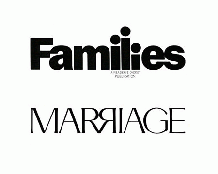
The above are two magazines from the Readers Digest stable. Again, the attempt to communicate what it is about quite figuratively through the logo catches my attention.
![]()
I liked this logo of a hair stylist for the cheeky humour it brings to the (dressing) table.
![]()
This was a logo created for a puzzle game called Cluenatic. This game involves unravelling four clues. The logo has the letters C, L, U and E arranged as a maze. and from a distance, the logo looks like a key.
![]()
This logo is too good. For the name Eight, they have used a font in which each letter is a minor adaptation of the number 8.
Eighty-20 is a small consulting company which does sophisticated financial modeling, as well as some solid database work. All their work is highly quantitative and relies on some serious computational power, and the logo is meant to convey it.
![]()
People first guess that 20% of the squares are darkened, but that turns out to be false after counting them. The trick is to view the dark squares as 1’s and the light squares as 0’s. Then the top line reads 1010000 and the bottom line reads 0010100, which represent 80 and 20 in binary. Kinda like the surreal green screen of The Matrix, they want us to read stuff in binary.
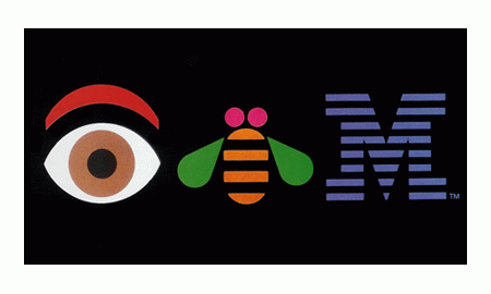
This was a logo designed in-house for some internal event at IBM. I like that they are quite relaxed about the logo, unlike certain other companies who do not like the logo to be tampered with in any way even for internal promotions.
You might think the arrow does nothing here. But it says that amazon.com has everything from "a" to "z" and it also represents the smile brought to the customer’s face. Wow, that is quite deep.
Excellent logic behind every logo.
Its been amazing and interesting to see such innovative logos
i like it very much good to know about this
it was awesome and interesting and thanks for bringing us such a good stuff
This is really amazing. In my free time I love reading and gathering information. This site is certainly one of the best sites! It’s really very helpful and so damn interesting. Very Impressive!
That was quite interesting especially the amazon one.:-)
very much interesting to learn something like this its great
I never noticed these things. It is very informative.
Its very interesting and good creativity.
It made the sleepy brain to think
The articles and the contents are very helpful & useful for all. Thanks to the creator :)
This stuff is amazing. Keep it up.
Excellent! We want more logos please.
I could never imagine the logic behind these logos. Thanks for sharing. Keep going.
I loved the logos. We need more of them. It’s very helpful.
Wow! I’ve learnt a lot. This is very interesting.
Amazing art work
Very interesting. There should be other logos as well.
This is GK abstract and very tempting to do something meaningful.
Oh my god! Thats really superb man. I really like it and hope to see more of them.
My mom always says that best things in the world are free of charge! I think that is true. Your website is best of best.
What a nice articles about logos. I Love IBM Logo very much as first I’ve seen it in IBM Indonesia Office in Jakarta. Nice!
really amazing.
It was really interesting to know about the meaning behind each logo :)
I apologize if I’m being repeating conversation, but the IBM logo shown here was created by the father of the modern day branding campaign, Paul Rand.
That is really good. I never thought of such things.
really its very intresting
It was really interesting as we do not tend to notice so much out of a logo but still more logos could have been placed.
Yes! Really its mind blowing. Amazing! I will share it with my friends.
The logos are super and excellent. Give some more logos. It will be useful to us.
It is really awesome, the deep sight of the company and their visions and the missions and lastly I must say that knowledgebase-script is forwarding lots of information to the learners. Makes people to share the information.
This is what I expected for a long time. Good and interesting information kiosk.
yes, its good and interesting
Very interesting Keep going more.
Excellent... Very good Observations. Thanx to sharing the beautiful article. Keep going :)
yeah a very good article .
really intersting
Really amazing and interesting.
Very good, it would have been still better if you people have added more. :)
It it quite interesting to view the site which has lot of information what we needed.
Thanx, for sharing it with us. Really gr8 article for new bie.
very interesting!